Brand Refresh and Local Growth Strategy for a Sustainable Property Care Company
GreenTech, a property care company focused on earth-friendly products, approached us to modernize their brand and grow their customer base. The goal was twofold: refine the visual identity to reflect their values, and design a growth strategy rooted in local, real-world engagement.


Locally Rooted
|
Locally Rooted |
Brand Clarity
|
Brand Clarity |
Visual Identity Refresh
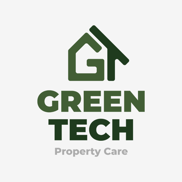
The project began with a full logo redesign. While the original mark emphasized sustainability, GreenTech needed something more versatile—able to scale with future service offerings without losing its clarity or intent.
The final design merges the letters “G” and “T” into the shape of a house. It’s a clean, contemporary mark that balances form and function, creating a brand asset that’s instantly recognizable at any size.


Local Lead Generation
In a digitally saturated market, we focused on a tactile approach: localized print. Property care is a visual, physical service—something people notice when walking through their neighbourhood. Door hangers became the medium of choice: approachable, low-cost, and impossible to ignore.
Each hanger was printed with a neighbourhood-specific QR code, allowing GreenTech to:
Track scan activity
Identify which areas responded most
Adjust ad targeting based on real-world data
This added a layer of performance insight to an otherwise traditional medium—helping bridge offline and online strategy.

Outcome
The combined strategy positioned GreenTech for long-term success:
A flexible, recognizable brand identity
A measurable print campaign rooted in local relevance
Smarter advertising decisions based on neighbourhood-level data
This case shows how analog tactics—when executed with precision—can outperform louder digital efforts and help a modern brand feel grounded, local, and trusted.
Tell Me About Your Projects
Interested in working together? Fill out some info and I will be in touch shortly. I can’t wait to hear from you!!